Alright! My new pride and joy is a traycase for my Dameron-remarqued
The Waste Lands, courtesy of our good friend Dick Olson, with original artwork of Blaine by Harrison Ryan. Before you see the final piece, I thought you’d like to see the sequence of artwork and ideas leading up to it.
When I approached him about doing a sketch, he was all enthusiasm (I caught him on a good day

). For those of you who don’t know, Ryan is a freelance artist who does fantastic work; moreover, he’s great to work with. Over the course of a few weeks we went back and forth with design ideas. I explained my vision of Blaine blasting, right to left, viewed from slightly below, through a canyon … and he hit the inks. Here was the very first draft, with several viewpoints:
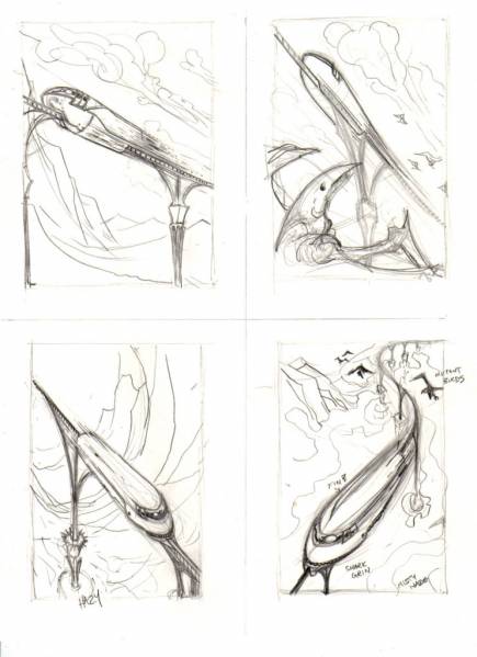
He got exactly what I was picturing with the upper left drawing, but I actually liked the one in the lower left better (going left to right and viewed from above). I particularly liked the way he curved the walls over and under, which to me gave the appearance of Blaine shooting through an underground tunnel, which lead to this:

I suggested a few changes (longer speed lines, etc.) and Ryan added his own touches, which lead to this:

This is my favorite version as a stand-alone piece of art. His personal influences are obvious in the canyon floor and walls (which look like waves and water) and the great detail in Blaine. One problem though; all of that won’t crossover to an engraving! Shadows won’t work, neither will many fine lines. So, back to the drawing board (ha ha). Harrison opted to curve the track, add a pylon or two, add shark's teeth to make him look evil, add some Dameron-esque critters, and simplify Blaine:


I really liked this last one, and knew that we were close, so we went for full ink …
(edit: forgot to mention, take a look at the side windows ... roman numeral III, for DT III ... Ryan's idea, along with the skull in the window to make him look a little insane)
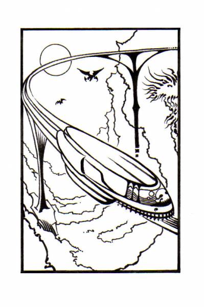
… and started thinking about a frame. Harrison thought some small icons in the corners would be appropriate; a gun, a rose, a key, etc. I wanted to go with something different, something directly related to Blaine. I thought about making the frame itself from some flying critters, have it so that they were circling and you were looking down through them at Blaine. “Too busy” said Ryan. I wanted to put some little critters in the corners:

Yuck, said Ryan.
Finally I came across Blaine’s route map, and modified it into a frame:

“I like it!” said Ryan. I think he was starting to get tired of listening to me. We incorporated the map:

“Looks great, but let’s lose the town names … too cluttered” said Ryan. “Yes, my liege” I muttered.
And just like that, we had a final:

Fired it off to Dick, after whcih I spent countless minutes pouring over pictures of wood grains and liner colors, until I finally said, “Dick, I wouldn’t know cherry from oak from a telephone pole … just make me a pretty one”. Dick tried to flip me off, but couldn’t (heh heh).
A few more e-mails, a week’s wait for the mail, and … voila:


I love it, and I love the fact that I was able to contribute to creating it. Working with Ryan and Dick was a blast. Also got a surprise in the mail from Ryan along with all the prelim drawings:

If anybody has an idea for a drawing or a traycase or whatever, you can see it in your head but just don't know how to bring it about ... contact Ryan and Dick. They'll work with you (patiently!) and do a phenomenal job for you!


 Reply With Quote


 awesome !!!


