


Very cool, Jon. Those look great together.


Very cool, Jon. Those look great together.


Very nice! Congrats Jon!


Congrats Jon. I'm still missing one of the three. You've given me the motivation now to go and find it.

Congrats! Could you explain the differences my man? Hard to see in your pics....Originally Posted by jonp

HELP ME FIND
Insomnia #459
ANY S/L #459


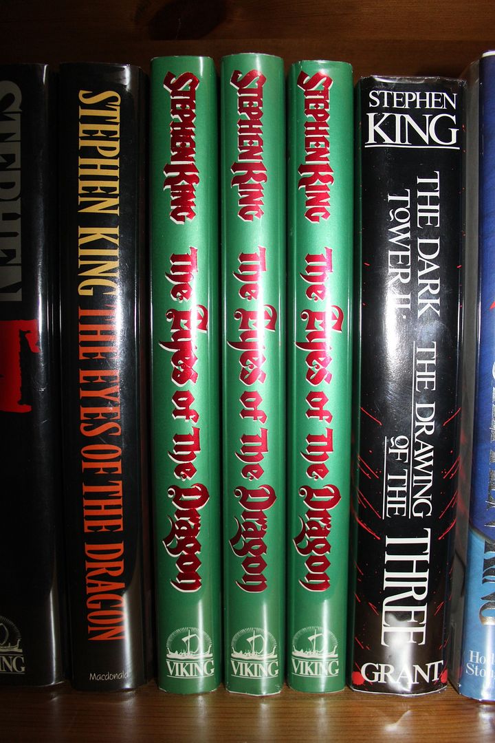
Thanks Kris, There were three different printers for the first US edition of EOTD. So the only difference in the whole book is on the copyright page (see photos below) where it lists the printers. Externally they are identical, apart from, it may be my imagination but the 'Haddon Craftmen's' variant (to the right) is slightly smaller than the two printed by Arcata Graphics.
Thanks Alan.
Thanks Dan.
Thanks Paul. I hope you find your final variant soon. Which one do you need? God, aren't we sad with these variants!! LOL!


Thank's, Jon. Never knew about the three variants.
The hunt's on again!
sk
It never ends Siep!
Jon, the one I'm missing is Arcata Fairfield, Pennsylvania.
FYI, although it isn't a thread that's commented on regularly, I did put together this list of variants and keep it updated. You can see the list in the first post: Stephen King Dust Jacket, Book, and Proof Variants
Incredible. They are in perfect shape too!!! I have been searching for a perfect one for awhile now!
HELP ME FIND
Insomnia #459
ANY S/L #459

Very nice acquisition, Jon!!!
28 in 23 (?)!!!!
63 in '23!!!!!!!!!!
My Collection: https://www.thedarktower.org/palaver...ion-Merlin1958
The Houston Astros cheated Major League Baseball from 2017-18!!!! Is that how we teach our kids to play the game now?????


Congrats, very VERY nice Jon !!!

My Stephen King collection
http://www.thedarktower.org/palaver/...on-Stockerlone
Non-King collection
http://www.thedarktower.org/palaver/...rlone-Non-King
I hope you find a perfect copy soon Kris.
Thanks Bill.
Thanks Frank.
New Proof today in perfect condition! I wish they had used this cover for the trade 1st.
Stephen King - From A Buick 8 - UK Uncorrected Bound Proof
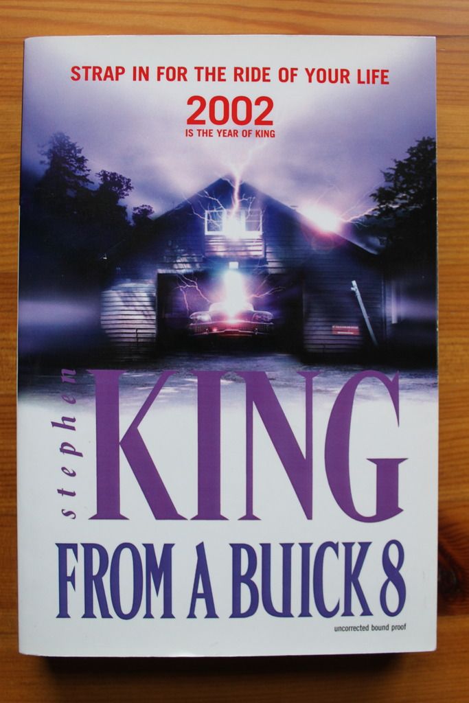
Nice one! I didn't know you were looking for this one, I have a copy in similar condition for sale. Neverheless - congratulations. And I agree about the superior cover art.
Thanks Michael. I wish I had known, I would have preferred to buy it from you. Do you have any others for sale? I need most of the proofs.
That's the only one I have left that doesn't really fit my collecting goals. But if you're ever looking for a second copy...


Nice, Jon! I agree--the art used on the UK trade edition has to be the worst. I wonder why they didn't go with the art on the proof.
John
Thanks John. Did they use this cover on any other edition like the trade paperback?
Congratulation Jon on the new proof. I know the general consensus is that the art used on the proof is preferred over the final cover, but I've always had a different opinion. I do agree that the proof version is nicer, but I actually like the final cover. Maybe something about the simplicity or starkness (if that's the right word) of it. That duotone sort of look. I may be very much in the minority of people who like that cover.
There was a proof DJ version with that art. I can't post a link right now as it keeps crashing on my iPhone but it's listed on the Variants thread.
Thanks Paul. Yeah, I recall seeing that before. Looks very smart on the hardback. Think it's Bob's if I remember correctly.
Bob has a copy of the book with that proof DJ and I know one UK-based collector who has one but I've never seen any other copies.
I just checked my paperbacks and there is a NEL paperback version with that cover art as well.
CThanks for checking Michael. I thought I recognised the artwork on another edition.
 Posting Permissions

 Reply With Quote


