But seriously, that looks pretty flippin' sweet.


But seriously, that looks pretty flippin' sweet.
At least it's head doesn't take up half the page


Pretty sad when the trade cover looks superior to the S/L.
Comparing the cover art that's been around for a few months makes me curious about how they did this exactly:
Seems like there is some very skillful compositing of individual elements that was needed to go from before to after.
Am I right in assuming that the AE's are not going to be numbered? Limited to 5000 copies but not numbered?

That is correct.....NOT #'dOriginally Posted by carlosdetweiller

Unnumbered.
everything he says is true, except for the cover art. It's just the lettering that sucks, the image is awsome...just two different artists depictions of it.
Promise me you'll always remember: You're braver than you believe, stronger than you seem and smarter than you think.


I have to say I like the trade cover much better.
John


Preordered the Scribner edition just for the cover! I have to have the Grant edition, of course, with it being the first edition, and all my DT 1-7 being Grant editions. But this cover is probably the best cover of a Stephen King book ever!

Better than UNDER THE DOME? I loved that one. I agree this new cover is very nice (except King's name). My favorite trade edition cover ever is still DIFFERENT SEASONS, by the way.

Will the gift edition and s/l edition have different covers (sorry if this had already been discussed)?
According to Grant, Jae Lee only contracted with them, not Scribner. I wonder who the artist is for the Scribner edition.
John
I have to say the trade edition fits the rest of the series but I really do like Jae's art. Guess I'll be getting all three.

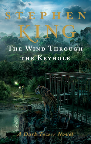
Here's the post from SKMB: StephenKing.com is proud to unveil the cover artwork for the mass-market hardcover edition of The Wind Through the Keyhole. The artwork by Rex Bonomelli details a lush world yet unseen by the Constant Reader. To view the cover artwork and for more information regarding The Wind Through the Keyhole, please visit our promo page at the link below.


Now that's a DT cover!!! Can't wait to find out how the Tiger fits in!!
Edit: I have to say that the Jae Lee cover is starting to grow on me the more I look.
28 in 23 (?)!!!!
63 in '23!!!!!!!!!!
My Collection: https://www.thedarktower.org/palaver...ion-Merlin1958
The Houston Astros cheated Major League Baseball from 2017-18!!!! Is that how we teach our kids to play the game now?????


The trade edition cover is sweet. I like the little dudes in the lower left hand corner. (You can see them on the large resolution version.)
I'm guessing that the reason the Grant cover has a green background is to evoke the forest atmosphere. But that's just a guess.

THe more I look at the Grant cover of the s/l, the more I like it.
I'm going the other way. Especially after seeing the Scribner cover. I think it (the Scribner one) is absolutely gorgeous. Jae Lee's..........not so much.
Do we know who the artist for the Scribner cover is?. I love it!.


The same artist that did UTD did the Wind artwork, right?
Rex Bonomelli. I don't remember who did Under the Dome.
John
I thought it was some cutting edge company that did the art, or was that just a firm giving special treatment to the original art? I seem to recall something along those lines.
28 in 23 (?)!!!!
63 in '23!!!!!!!!!!
My Collection: https://www.thedarktower.org/palaver...ion-Merlin1958
The Houston Astros cheated Major League Baseball from 2017-18!!!! Is that how we teach our kids to play the game now?????
Ms. Mod credits the art to Rex Bonamelli who is, according to his website, a graphic designer and art director for Scribner. I'd like to know what the origin of the various elements are; if they're paintings by Mr. Bonamelli then very impressive, but my completely uninformed assumption is that his primary role was to composite various elements together. (I would love to be proved wrong, though; it really is quite spectacular, especially the full wrap-around shown on stephenking.com)
I don't recall off hand, but I can't shake the memory that the UTD cover was ground-breaking in some way. My old brain just can't remember how. Laser-Tech?
28 in 23 (?)!!!!
63 in '23!!!!!!!!!!
My Collection: https://www.thedarktower.org/palaver...ion-Merlin1958
The Houston Astros cheated Major League Baseball from 2017-18!!!! Is that how we teach our kids to play the game now?????
 Posting Permissions
 Reply With Quote