


Never post immediately following P/T. I'm always a bit grumpy right after, Nurse Ratchet has her way with me!!!


Never post immediately following P/T. I'm always a bit grumpy right after, Nurse Ratchet has her way with me!!!
28 in 23 (?)!!!!
63 in '23!!!!!!!!!!
My Collection: https://www.thedarktower.org/palaver...ion-Merlin1958
The Houston Astros cheated Major League Baseball from 2017-18!!!! Is that how we teach our kids to play the game now?????

Well, just get a little stronger every day until you can rip that sink out, throw it through the window and make your escape!
WANTED
US 1st Printings. I have THESE
#92 IT Portfolio (or the #95 IT to swap for the #92 that I have)
Any #95 SK-related Cemetery Dance Edition
Any #7 PS Publishing Edition
Sleeping Beauties: Signed Tour version.

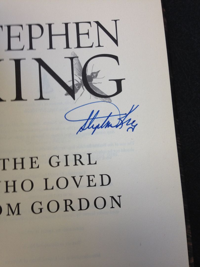
That signature kind of flows easily, as if he was on something mellow


Thanks for all the feedback! Interesting to see what you all thought of the signature.This is in a Firestarter proof.Originally Posted by carlosdetweiller


Do we have a thread or list for paperback first editions?
"One day you're going to figure out that everything they taught you was a lie."
Not that I know of. There should be one for sure. I like to collect the paperback 1sts.


Stop creating work for me. I'm here 10 hours a day as it is.

Only 10?! That's not enough. I think I'm gonna go create a new paperback thread now!

Spoiler:
Always floored by that pic.
[QUOTE=Randall Flagg;948033]
Stop creating work for me. I'm here 10 hours a day as it is.
I made a list with price and isbn it's in a thread somewhere
You might need to narrow that down a wee bit.
"One day you're going to figure out that everything they taught you was a lie."
I found it in the Wiki.
http://www.thedarktower.org/palaver/...ns&do=comments
I'll continue my discussion there.
"One day you're going to figure out that everything they taught you was a lie."
Nice find!
That seems a wee harsh. To each their own, I thought. Beauty is in eye of the beholder, etc. He qualified his evaluation of the sig's aesthetics as being in his "humble opinion". One opinion among many, offering it honestly, and never implying that fugly = fake. There are many legit SK sigs (particularly flat signs or inscriptions) that come down to the collector's taste.
If a sig isn't part of an S/L that usually includes upgraded book materials, then it's just a signed trade, and all one pays more for is the perceived beauty and veracity of a signature. And the beauty part is always subjective. Hence zelig's question.
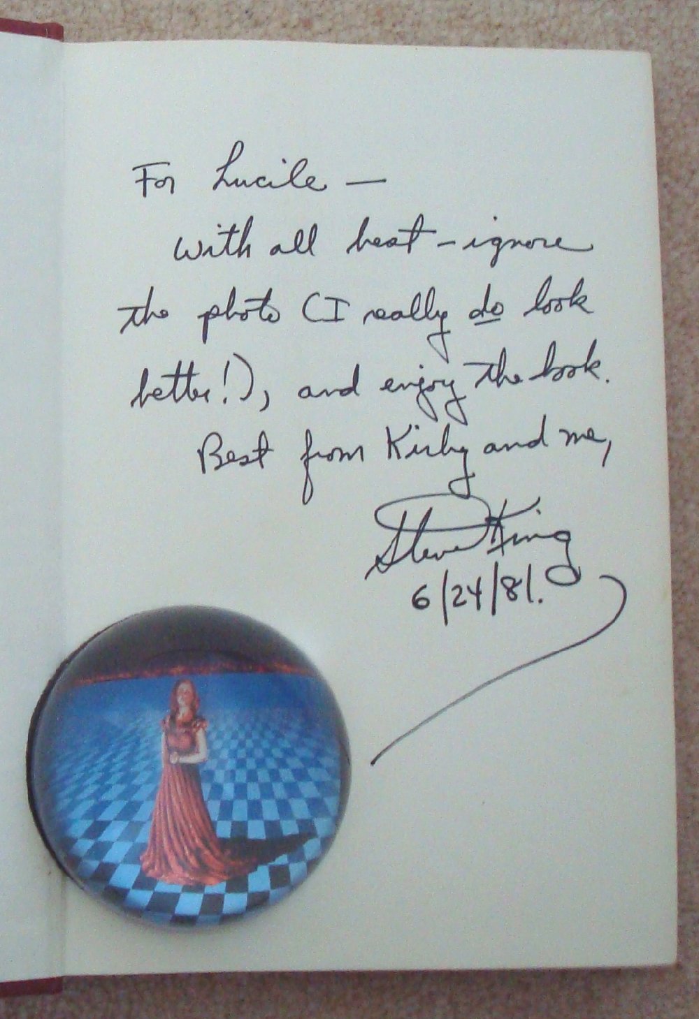
What's the opinion on this signature. Looks legit to me, but wanted to ask the experts here.
The absence of a thing, this can be as deadly as the presence. The absence of air, eh?
The absence of water? The absence of anything else we're addicted to.
- Baron Vladimir Harkonnen


Looks good to me.


Looks good to me too.


Looks okay to me.
John
Would look better to me if it were on my shelf.
The absence of a thing, this can be as deadly as the presence. The absence of air, eh?
The absence of water? The absence of anything else we're addicted to.
- Baron Vladimir Harkonnen
Thanks guys!
The absence of a thing, this can be as deadly as the presence. The absence of air, eh?
The absence of water? The absence of anything else we're addicted to.
- Baron Vladimir Harkonnen
Good luck. Hope you get it!


When Night Shift came out was the cover white or beige? From all the 1st editions I have seen they almost look beige and the BCE editions have both.

I would say it was 'off-white' and many DJs sort of tanned/discolored over time. My 1st/1st is definitely not beige but neither is it really white.
 Posting Permissions
 Reply With Quote


