I used to hate small avs but I got to like them here. I will be strange to have bigger ones. :)
Printable View
I used to hate small avs but I got to like them here. I will be strange to have bigger ones. :)
Yeah but if we're hosting the av pics here, wouldn't that increase our site's bandwidth use? Again, I'm a rookie when it comes to this shit, but just saying, bigger avs, bigger files sizes the site is hosting, as opposed to pb or flickr or some other place hosting banners.Quote:
Originally Posted by Daghain
We have a fast processor, lots of memory and a great deal of bandwidth for the site.
As for the thought of signature pics being 700 pixels wide, I'm against it.
As I look at your signature now, the text and pic are a combined ~>1,000 pixels wide.
My PC monitor resolution is 1680x1050. My laptop is 1920x1080.
http://img209.imageshack.us/img209/5739/hemank.jpg
Ok, but what's the difference between mine, and say, Ladyhitch's, or Paths, or Daghain's even? The width is there, pic or no. I could have left the pic on the left and put the text underneath it and it'd be just as long as some of the other people's sigs.
I'd rather have one like Jean's is now, that takes up the width of the screen but not a vertical giant, than I would something like Odetta's or Mattrick's. At least mine is limited in width.
And I'm not knocking anyone's sigs, just saying. Back at .net we had some trouble with people having sigs that were half a page long, sure made it a pain in the ass to scroll around.
Now, having said my piece, I changed my mind about the 700 long, and why don't we just keep things the way they are? I don't remember anyone complaining about the 100x100 or the 200x500 either. I'm using a 200x200 now, and I like it, but I don't see that I need it, or that it makes the site funner to use.
The best part is having a rational discussion.
Thanks for commenting and more importantly, thanks for being a member.:grouphug:
:)
If He-Man's pic were wider, wouldn't that change the margin for the text? Here, see how what my screen displays differs from what you showed from yours--
http://i148.photobucket.com/albums/s12/POTT2007/sc.jpg
The sig grows longer when text justification is narrower, but that shouldn't be unreasonable so long as you keep the visible character limit. (I certainly wouldn't be in favor of dropping that!) Still, I'd think that allowing slightly wider pics wouldn't necessitate scrolling the page... unless there are technical details of which I'm unaware.
personally i don't like the increased avatar, they impede too much onto my page so the whole page is shoved across to the left, so when it comes to pics or reading a post i am having to move the page across, which may not sound much but i only have a laptop and no mouse, so believe me its a pain in the arse
its also taking away from the text that someone is posting
just little old me's opinion:unsure:
We've added Black Stealh 4.0.8 to your choice of displays for the site.
To view, use the dropdown menu at the bottom left of the page. There are now 3 styles available, with more to come. If you don't like one style-try another.
This thread to be merged into Announcements thread in 3 days.
I prefer the Take Five one, but keep doing the good work guys!
gonna play with the Black Stealth for awhile... see if I like it!
Too dark for me!
John
Same here. I'm still using the default style.
It's just another choice. It does give an idea what the site would have looked like if we went with a black background.
I actually prefer the black stealh I can see things much better.
I think I'll continue using the Take Five style - peach background is easier on the eyes for me.
But thanks for giving us more options, guys!
I love the Take Five, please keep it, but it's good to have choices.
ooo i like this one
:thumbsup:Quote:
Originally Posted by kluker
That is exactly the point: Give people choices so they can decide what works best for them.Quote:
Originally Posted by pablo
I use the plain default vBulletin skin at work, but use the Take 5 skin at home.
There are now 8 different choices to view the forum.
Check them out on the lower left drop down box.
There should be something there for most anyone.
EDIT:
Most browsers remember the style you have chosen. If not, go into your Control Panel and change your default choice. Procedure:
Settings (Upper right corner)>
General Settings>
Miscellaneous options-Forum skin-use the drop down box to select the style of your choice>
Save settings
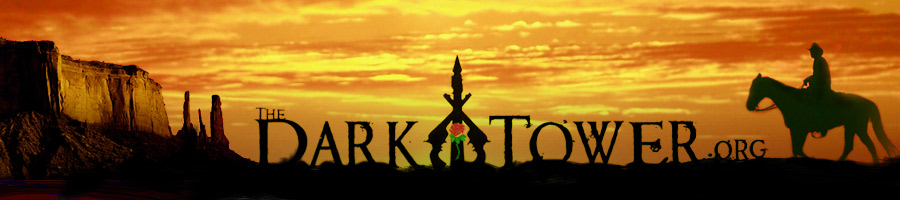
On three of the skins (Vbulletin default, Take Five 4.0.8, and Take Five Alpha ) the banner is designed to fit the screen of the viewer, the wider your screen, (higher your resolution), the more of the scenery you see left and right.
The other 5 skins have a non-fluid image placed in the upper left. One of the skins-Folio Green, has an entirely different image.
This thread to be merged into the Announcements thread in 3 days.
I think I like the blue best, with the gray folio black second.
Is there any way to keep the selection for all forums? When I switch forums, the color reverts to the orangish color.
John
Do you mean when you leave the site? Closing your browser?
I'm surfing and have no problem. I'm using Firefox.
I'm using IE8. Whenever I change forums (for example, going to the main--Palaver--forum from Calvin's Corner, the color which was the blue in Calvin's Corner goes to the orangish in Palaver. Also, after I've changed the color, whenever I use the Back button, the color reverts to the orangish also. No big deal, but it IS frustrating.
John
I tested the following browsers:
IE8
Google Chrome
Firefox
Safari
Only IE8 always takes me to the default skin. Sorry but I don't think we will change Microsoft.
No problem.
John