


Originally Posted by Theli

I have a bad memory and don't remember who I sold it to, except he was in Canada and the shipping was a nightmare.


I have a bad memory and don't remember who I sold it to, except he was in Canada and the shipping was a nightmare.


Surly has it. 100%... I tried to buy it like 3 times now. haha
HELP ME FIND
Insomnia #459
ANY S/L #459
Got The Stand Portfolio today - #30. So if I wasn't one of the last ones to order, there must not be that many left.
I got 34.
I just received 36.

#14 for me
Well, if the info on the site is true (numbers assigned in order), then there's just a few left, I guess!
I received #10. So....what do you all think about this portfolio?


Curies to hear from folks who have the old and the new one , if there is a mayor difference


Hmm One day I might come knocking on your door for that #....
You are safe for a while, but not forever!
"A real limited edition, far from being an expensive autograph stapled to a novel, is a treasure. And like all treasures do, it transforms the responsible owner into a caretaker, and being a caretaker of something as fragile and easily destroyed as ideas and images is not a bad thing but a good one...and so is the re-evaluation of what books are and what they do that necessarily follows." - Stephen King


I posted this elsewhere, but I got #20.
John
Any thoughts on build quality? Just number talk on here? Come on guys who got em... spill the beans
HELP ME FIND
Insomnia #459
ANY S/L #459
I'm a little let down by the hard shell "case" as I thought it would be more of a clamshell type. It's more like a hardcover folder. Overall though I think the quality is excellent - I would put it on par or slightly better than CDs portfolios. The only thing that is better about the older portfolio is the gold stamping on the front - this portfolio is somewhat plain in appearance.
I thought the quality was nice. The folder is solid and gives it some nice protection; better than the Carrie portfolio folder from CD, but it should be for the price! I don't have the earlier one to compare it to. Now it can go in the stack of, hmm, what do I do with this now stuff (other art portfolios, Knowing Darkness)
Took me about three hours to remove all the tape wrapped around it

I did damage it getting it unpacked, or rather repacked. The tape caught on the cover and lifted some of it off when I lifted it.
I got number 37.
Mike
Wanted:
'Salem's Lot Portfolio #606
Fairy Tale UK S/L
It took me about 45 minutes and a sharp knife to unpack mine. I did it without harming it, though.
John
Thanks for the tips guys. I'll be careful when mine gets here!!
HELP ME FIND
Insomnia #459
ANY S/L #459
It also took me quite a while to get it released from all the tape, etc. I, too, was worried about damaging the portfolio. I'm going to come out and say I am not overly impressed with this production. Bernie's inking is very dark and bold both in person (i.e. the originals) and in the prior reproductions (i.e. the earlier portfolio and in the published book). I found these recent ones to be too light, almost washed-out in appearance. Maybe it is just me. I'm glad I didn't pay full price. What do others think?
Do you think they had the originals to reproduce?
No. They are scattered to the wind and in the hands of private collectors.
I own a set of blue lines for the original.
John
I agree with carlosdetweiller. I thought the blacks aren't black enough. I wanted a much richer black on in the drawings but they do seemed faded.

Had my Original Wrightson reframed and picked it up this AM!
Went with a Deep Brown Leather/Wood frame that ties in nicely with the overall piece. Also pulled back the mat to display the pencil marks from the drawing....
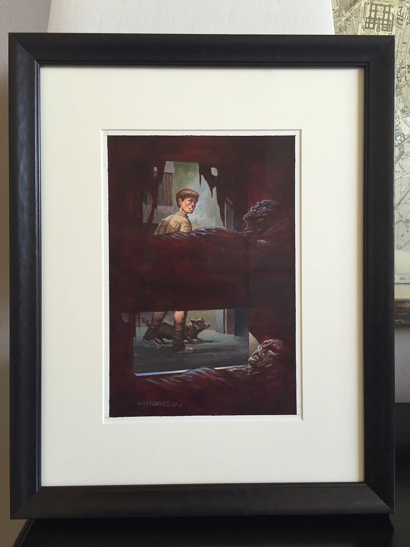
John
It's stunning Tim. Another bang on frame job brother!!!
HELP ME FIND
Insomnia #459
ANY S/L #459
 Posting Permissions
 Reply With Quote
